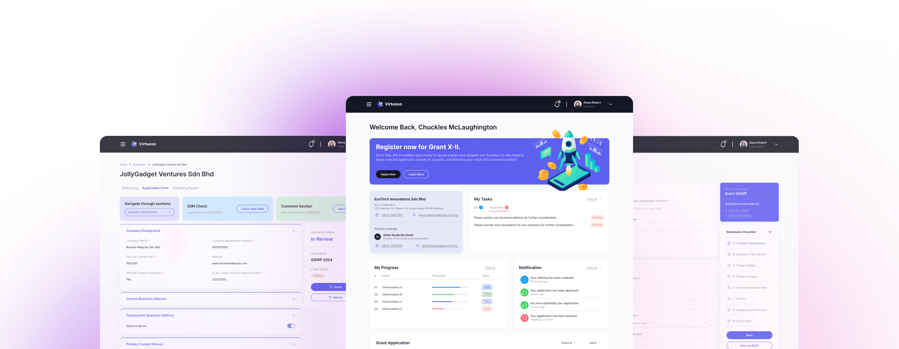
Empowering Efficient Grant Management
Simplifying grant applications, reviews, awards, monitoring and more, enhancing efficiency and transparency for the organization and applicants.
Sparkle
UI/UX Designer
2023 -2024
Our goal was to create a user-centric grant management system by digitizing and automating processes. This reduces manual data entry, errors, and speeds up decision-making with seamless database integration. Ultimately, we aim to support innovation and growth in Malaysia by making grant management more efficient and user-friendly.
0% System; 100% Manual
Without a unified system, tracking application statuses was difficult, and manual data entry was often inaccurate.
Lack proper process
Lacking a system, processes were unestablished, with documentation stored in Google Drive. Manual reviews and data entry were inefficient and wasteful.
Vague Scope
The business did not clearly define the scope, leaving most modules and deliverables vague and exploitable. The project timeline added to the challenge.
Time constraint
Designers had to complete research to high-fidelity wireframes within 15 days per milestone, covering over 600 screens.


Road to success
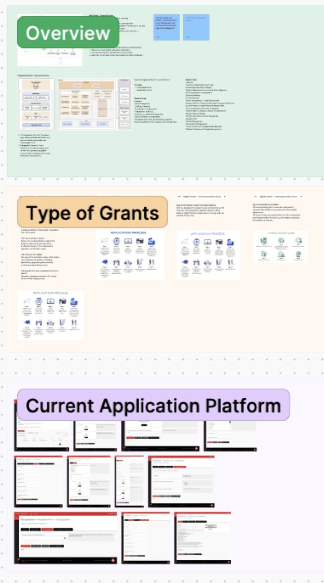
With a team of one project manager, two designers, two business analysts, and one tech lead, we hosted several requirement-gathering workshops. These workshops aimed to gain insights into users' processes, pain points, and stakeholders' expectations. We also reviewed existing paperwork to determine the best way to digitalize and automate the processes.
Road to success
To design the best solution, the team created custom workflows, user flows, information architectures, and wireframes for the Grant Management System (GMS). Designers and analysts validated each step with stakeholders to ensure alignment and reduce miscommunication, while collaborating closely with developers to ensure feasibility within time constraints.
Work flows
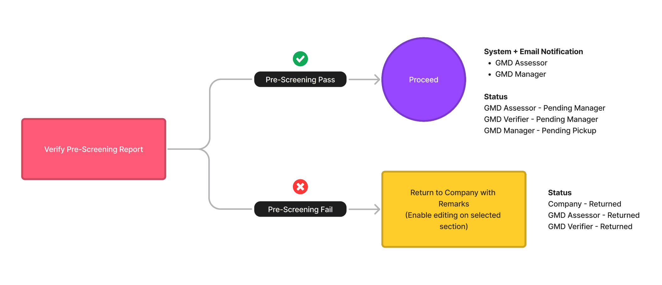
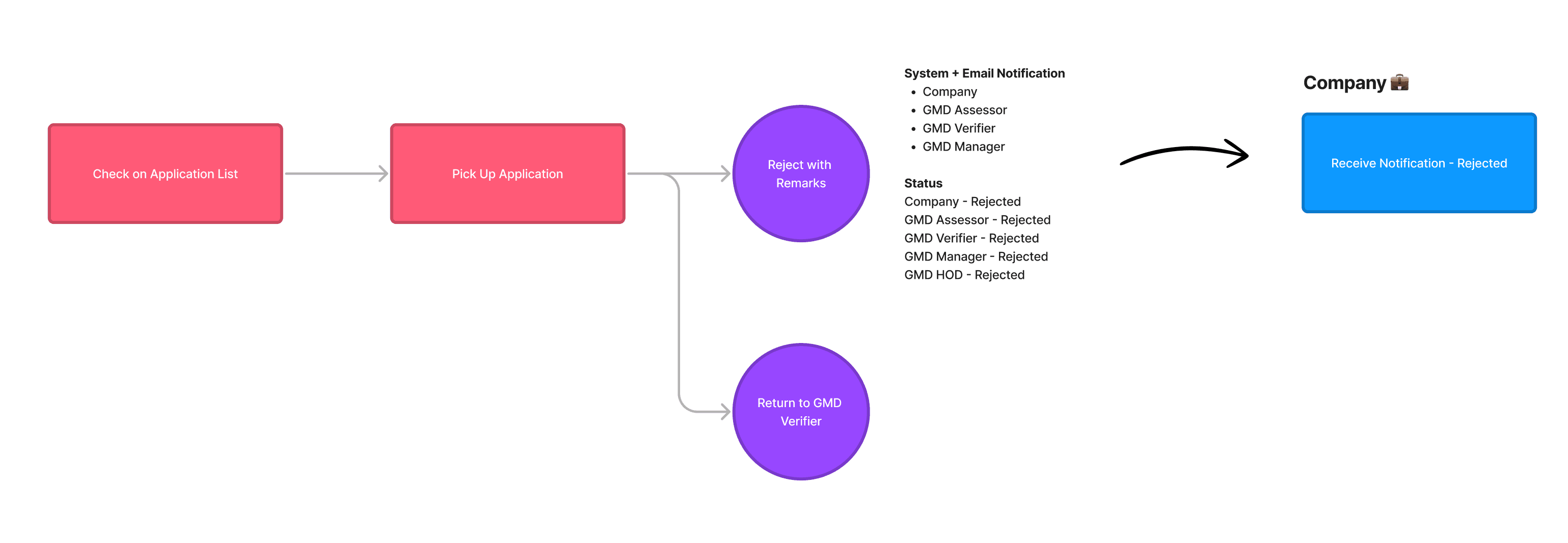
Detailed workflows for each module were broken down and mapped out for client validation and team understanding.

User flows
User flows were meticulously crafted and broken down to better understand user needs in each of their processes.



Information Architecture
Multiple information architectures were created to suit the differing needs of internal and external users.
Road to success
Features
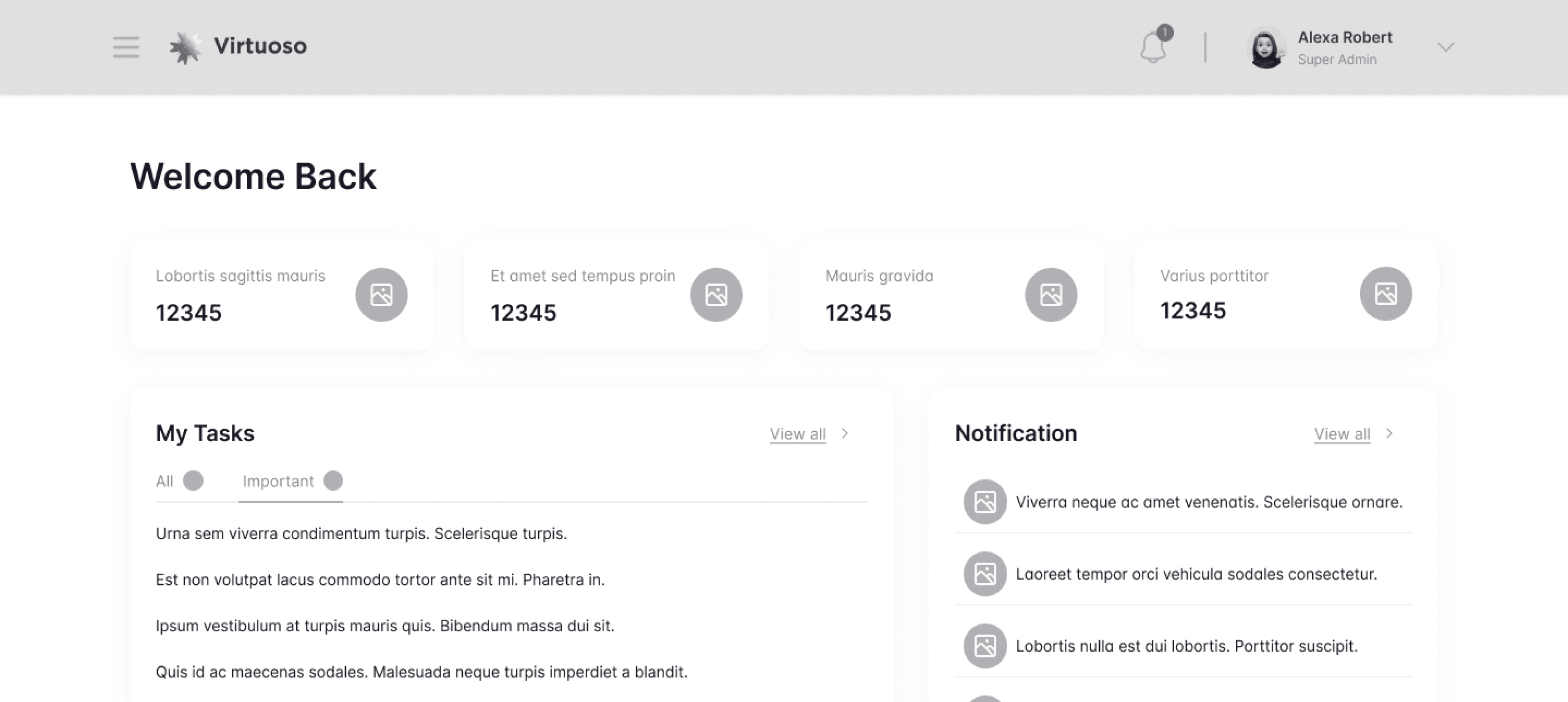
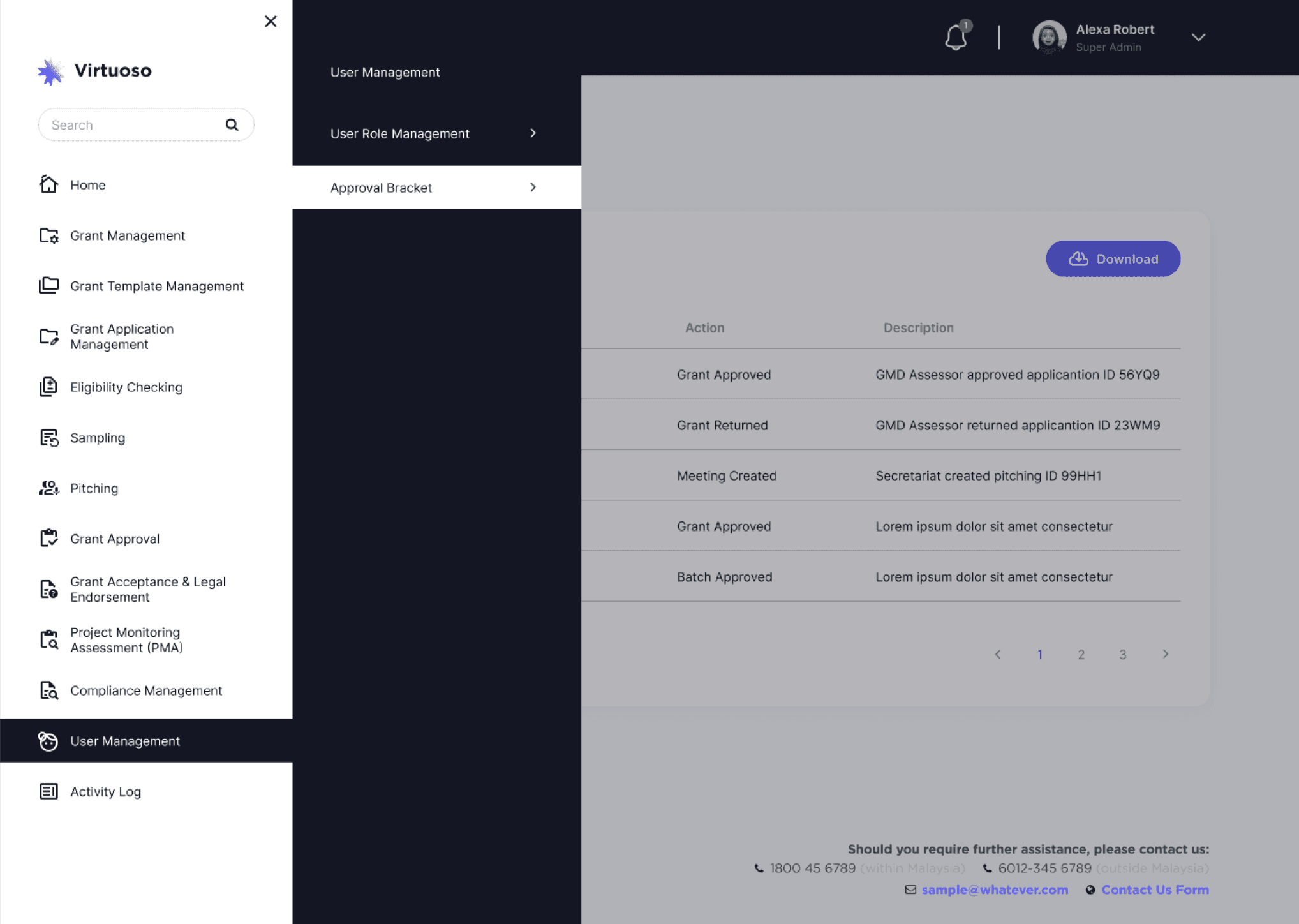
With over 10 modules in the platform, we prioritized clear and direct navigation for all users. By organizing each module into distinct processes, we minimized confusion and made it easier for users to find and complete their tasks.
Features
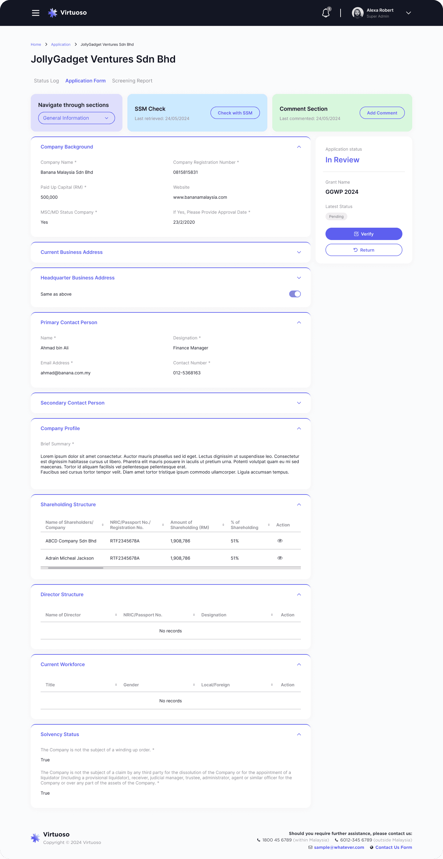
The system includes an embedded live SSM check for reviewers to conveniently verify applicants' legitimacy. Additionally, it facilitates cross-communication between internal users and applicants, ensuring easy and efficient interaction. Other features includes, AdobeSign, custom Finance API etc,
Features
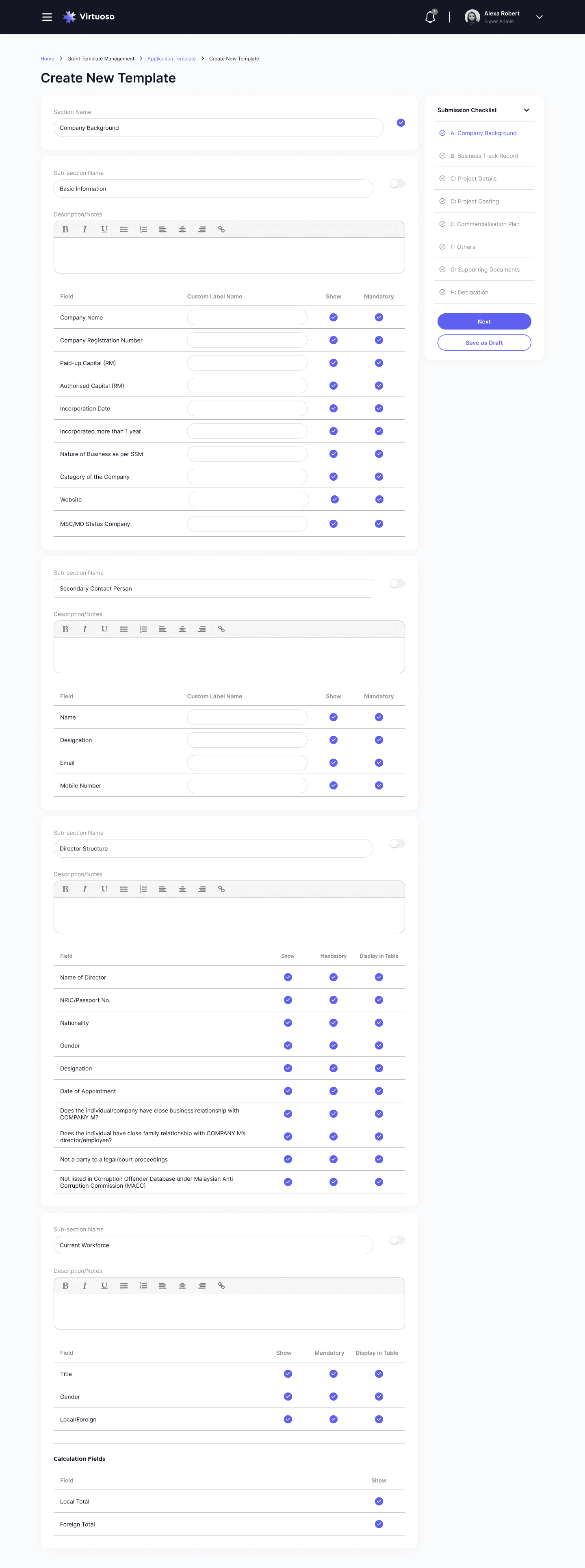
Customizable forms allow internal users to create new templates for different grants. The system features straightforward navigation, convenient show/hide options for each section, and text fields for descriptions where needed.
Accomplishment
With the solution, we believe the system significantly transformed the efficiency and transparency of grant management processes. By addressing key pain points and leveraging modern design principles, the system has paved the way for a more efficient, transparent, and user-centric approach to grant management.

Enhanced User Experience
✮ Intuitive interface and streamlined workflows simplify grant management.
✮ Automated reminders keep users organized and reduce errors.

Improved Process Efficiency
✮ Digital system saves time by eliminating manual data entry.
✮ Flexible templates adapt quickly to different grant requirements.

Data-Driven Insights
✮ Real-time analytics provide clear insights into application status.
✮ Progress tracking helps optimize applications.

Collaboration and Transparency
✮ Centralized platform improves team communication and collaboration.
✮ Transparent processes build trust and confidence.
chelstes.com
